

Perfect Properties is a responsive web, and native, app the provides private real estate investors with information on properties to buy. Based on the design criteria mentioned in the project brief (link), I was responsible for designing the user flow for some of the key features of the app, and then designing the user interface.
I started with creating user flows based on the user stories provided in the project brief and then began working on the user interface. I created a paper prototype to conduct in-person tests, which all the users were able to complete without any problems. I then went on to create mid-, and high-fidelity wireframes in Sketch.
Investing in real estate can be a very stressful decision, especially for first-time investors. With that in mind:
-
The colours I chose were inspired by the Four Elements; an earthy green is used as the primary colour, complimented with a deep blue, and a bright yellow as the accent colour, all against a pale-white backdrop. The project brief mentioned using greens or blues to style the app, so I combined green and blue to create my primary colour.
-
The colours chosen convey a message of calm, which is crucial because investing in real estate may cause users to get anxious and overwhelmed.
-
Keeping the user in mind, all the shapes and icons have rounded corners as opposed to sharp corners, as they take less cognitive effort to visually process. Psychologically speaking, as children we learn that sharp corners may hurt us and that rounded corners are safer (think a fork vs. a ball). Thus, according to research, we are conditioned to trust rounded corners, and tend to avoid sharp edges because in nature, they can present a threat.
Ultimately, my goal was to provide users with a fun, positive experience when using the app, so the decision of investing in real estate doesn’t seem intimidating or stressful, but exciting and enjoyable.


TELL YOUR STORY
I'm a paragraph. Click here to add your own text and edit me. Let your users get to know you.
The main idea behind choosing images for mockups was to make sure they seem real and relatable. The homes should look authentic and not staged. I believe these images achieve that goal.
I also made sure that all the images were taken during the day so users can see the details of the building and the rooms, as well as making the app feel fresh and airy, which complements the colour palette.
The picture of the family (below) is used in the sign in and sign up screens as a background image. That image is blurred when used in the app. The idea was to convey a feeling of ‘togetherness’ and ‘family’ but at the same time not being too imposing with a stock photo of a typical nuclear family, and respecting diversity.


-
Set up your investment criteria when creating your account
-
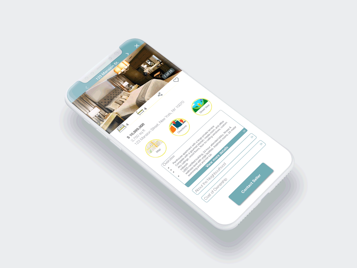
Browse curated properties based on your preferences, or start a new search
-
Make an informed investment decision based on the information provided


Thank you